This is a crosspost from VanessaSaurus, dinosaurs, programming, and parsnips. See the original post here.
Happy New Year! We’re on the 9th day of the month and I’m still in shock that we’re 20 years into the century, so I’m going to allow myself to say that. And actually, this post is related to that too.
What is CodeArt?
As folks were writing up their yearly accomplishments and creating goals for the new year, I didn’t really want to do either. I tend to not make resolutions because when I want to do something I do it immediately, regardless of the time of year. I didn’t really want to face the low self-esteem dinosaur that lives inside me (and many of us) and try to make light of some random list of things that I accomplished. I’m fairly sure that most of my work is not incredibly meaningful, and I believe that this is a realistic life perspective to have, albeit it might be a bit depressing for some. We are all continually learning, and as soon as we are satisfied with some bit of work, we become complacent and forget that. So instead of applauding some random list of nothing, I presented myself with a different challenge:
How can I visualize the last decade of code?
Keep in mind that most of what I’m about to share is for fun, and (still) useless. I wanted to let the data speak for itself, or let some derivative of the code that I wrote generate something pleasant to look at. Or if not pleasant, I can call it abstract and arty. You know, I’m pretty sure that artists these days can poop in a fishtank and call it art, and you can’t really argue with this profound performance. I decided to generate a library, codeart, that would be a fun experiment to turn lines of code into something visual. I started the day before the new year, worked on it in free time, and finally decided to end the infinite tweaking last night.
Enough is enough, dinosaur! No more ideas! Stop it! You have work to do!
You see, the great thing about experimental and fun libraries is that you can go to town on engineering unecessary features, or writing functions that aren’t more than experiments. The output of these functions, artistic renderings generated by code, I call “codeart.” And I’ll share a few examples with you in this post today, most of which you can find under codeart-examples. If you don’t want to read through this post, just jump down to Too Long Didn’t Read.
How does it work?
1. Build a CodeBase
Before I dive into examples, I want to outline the general logic that underlies each of these functions. There is a class, CodeBase that will hold one or more instances of CodeFiles, each of which is a file listing that follows some logical grouping. I can add files from a GitHub repository or a folder on the local filesystem, and then derive groups based on extensions, dates, or some other custom function. So at the end of the day, we generate a code base, add files to it, and then are ready to build a model.
from codeart.main import CodeBase
code = CodeBase()
code.add_repo("https://github.com/vsoch/codeart")

code.codefiles
{'.txt': [codeart-files:1],
 '.py': [codeart-files:10],
 '.in': [codeart-files:1],
 '.md': [codeart-files:2],
 '.html': [codeart-files:4],
 '.ttf': [codeart-files:1],
 '.yml': [codeart-files:1]}
2. Train a Model
Next, we want to train a model to learn color embeddings for each group, or for all the files combined (in the case of not having many files). What does this mean? It means we train a Word2Vec model with three dimensions, one for each of the color spaces (red, green, and blue).
code.train_all()
If you are familiar with word2vec, you’ll know that we extract terms from the input corpus (in this case, code and associated files) and then generate embeddings (dimension 3 in this case) for the vocabularity. Then we can find similar words based on the vocabulary. For example, here is the term “rgb” that is used as a variable several times.
code.models['all'].wv.similar_by_word('rgb')
[('for', 0.9997371435165405),
 ('word', 0.992153525352478),
 ('vectors', 0.9841392636299133),
 ('model', 0.8868485689163208),
 ('width', 0.8443785905838013),
 ('images', 0.8223779201507568),
 ('group', 0.7964432239532471),
 ('attr', 0.6789760589599609),
 ('lookup', 0.6657953858375549),
Here is a peek at the vocabulary:
code.models['all'].wv.vocab

{'github': <gensim.models.keyedvectors.Vocab at 0x7f01270ea080>,
 'codeart': <gensim.models.keyedvectors.Vocab at 0x7f01270e5ba8>,
...
 'or': <gensim.models.keyedvectors.Vocab at 0x7f01270e3b38>,
 'group': <gensim.models.keyedvectors.Vocab at 0x7f01270e3b70>,
 'word': <gensim.models.keyedvectors.Vocab at 0x7f01270e3ba8>,
 'model': <gensim.models.keyedvectors.Vocab at 0x7f01270e3be0>,
 'self': <gensim.models.keyedvectors.Vocab at 0x7f01270e3c18>,
 'filename': <gensim.models.keyedvectors.Vocab at 0x7f01270e3c50>,
 'files': <gensim.models.keyedvectors.Vocab at 0x7f01270e3c88>,
 'attr': <gensim.models.keyedvectors.Vocab at 0x7f01270e3cc0>}
And a vector for a term:
code.models['all'].wv['github']
array([ 0.15250051, -0.04457351, -0.10403229], dtype=float32)
You’ll notice that the base model above isn’t in the RGB space - I didn’t want to embed my bias in the library, but make it a choice by the user. We would use a different function to derive those vectors:
vectors = code.get_vectors('all')

            0    1    2
github    244   96   40
codeart    26   83  125
...
self      105  206  200
filename  236  191  155
files     139   29   35
attr       90  188  107
There are our colors! And yes, it’s a pandas DataFrame, which I did begrudgingly because I’m not a fan. The innovative part (that I’m sure someone else has done) is choosing a dimension of 3 so that the vectors above (which are fairly random in values) are mapped to the color spaces ranging from 0 to 255. The library then goes a step further by calculating counts (the extent to which each word is represented for a group):
groups = code.get_groups()
# ['.txt', '.py', '.in', '.md', '.html', '.ttf', '.yml']
counts = code.get_color_percentages(groups=groups, vectors=vectors)
I could then look at the term “github” and have an understanding of it’s prevalence across file types (or the groups you’ve chosen).
counts.loc['github']

totals                  49
.txt-counts              1
.py-counts              13
.in-counts               0
.md-counts              32
.html-counts             3
.ttf-counts              0
.yml-counts              0
.txt-percent     0.0204082
.py-percent       0.265306
.in-percent              0
.md-percent       0.653061
.html-percent    0.0612245
.ttf-percent             0
.yml-percent             0
Logically, we see github mostly in the markdown files, and then a tiny bit in Python and other files. You could use this information to determine opacity of a color, for example. More on this later! Using these simple groupings of data we can then do a bunch of wacky stuff with rendering images for the files, generating color maps, and interactive portals. Onward to the examples! This turned into several little projects, and I only stopped because the responsible adult in my head told me to. I’ll discuss each separately.
Examples
Example 1: Summary of the Decade
Since my original goal was to summarize my programming for the decade, I’ll start here! I decided to choose my entire Python code base, which I knew would contain files as far back as 2010. I couldn’t use timestamps on the files since they were generated when I uploaded them to my new computer, so instead I wrote a script to find repositories under some root (my Python code), and then used the GitHub API to derive the creation date (the year) that the repository was created. I then added the files for the folder to a group based on this year. The full code for the example (parsing GitHub repos by creation date using the GitHub API) is provided at this script. Let’s walk through the visualizations created with that exploratory script.
For my first shot, I made a little dinky animation, and the idea was to render the opacity of the terms (each an embedding in the model, and RGB) based on the frequency of the term in the relevant files for the year. That came out like this (click to see the larger version).
What’s wrong with this? You can’t explore it, and you can’t read the text. My graduate school advisor would kill me! I can see the colors, but I can’t really tell what terms they correspond to, and what terms are relevant for any given year. I decided to do better with an interactive version. I first created an unsorted version (warning, compute intensive page there)
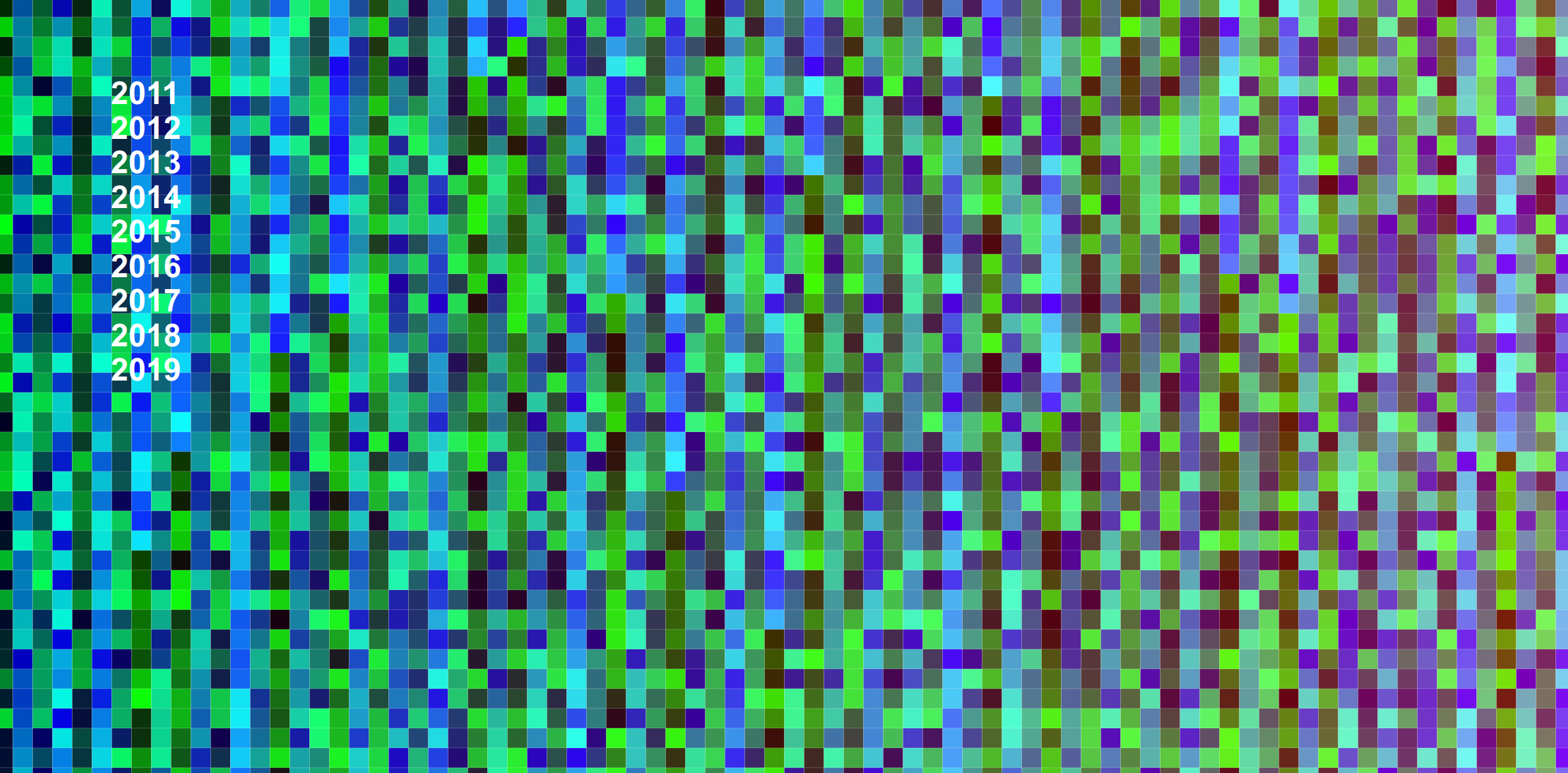
and then improved upon it with a sorted version, which is much better because promixity of color also means proximity of the terms.
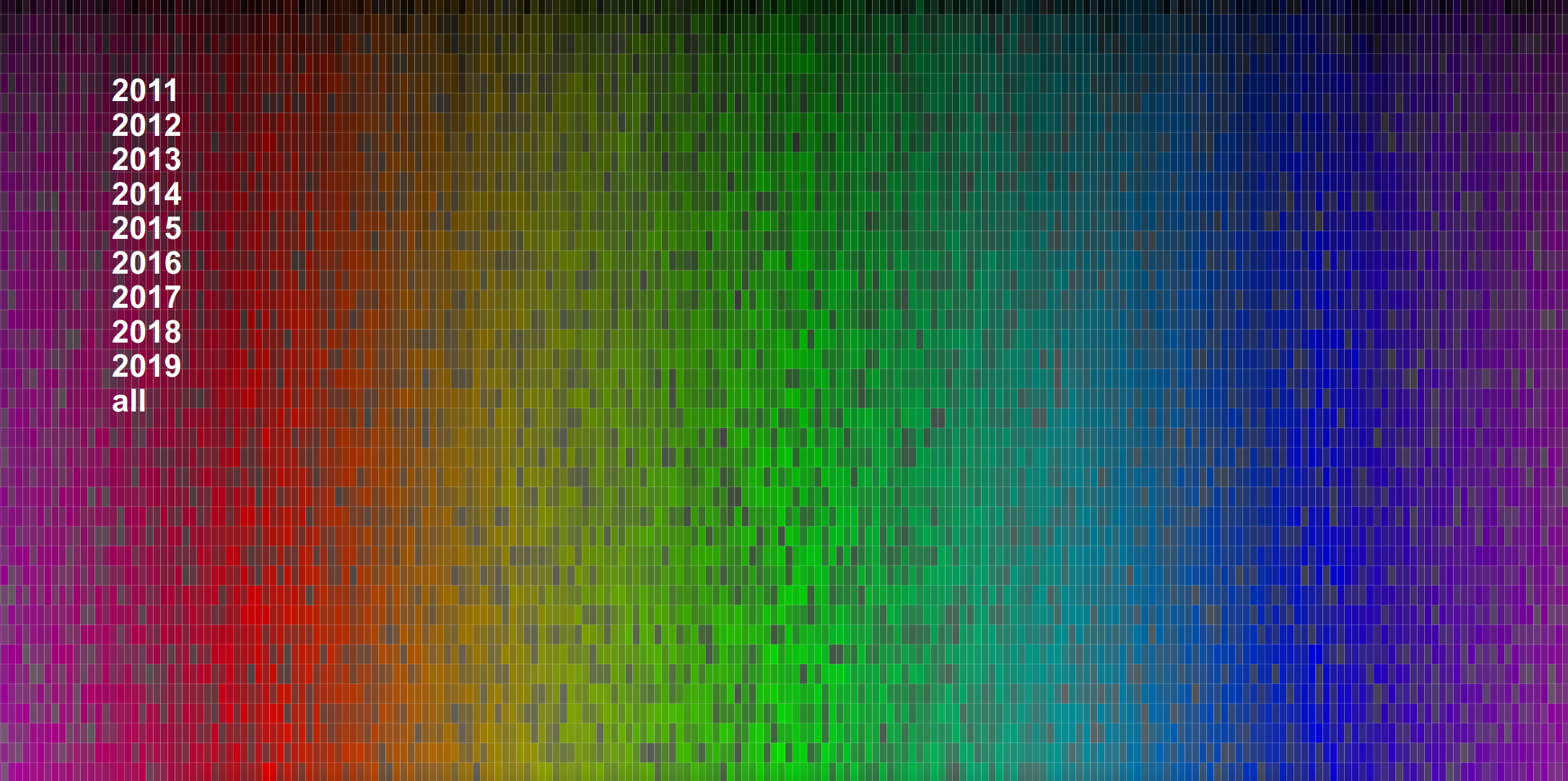
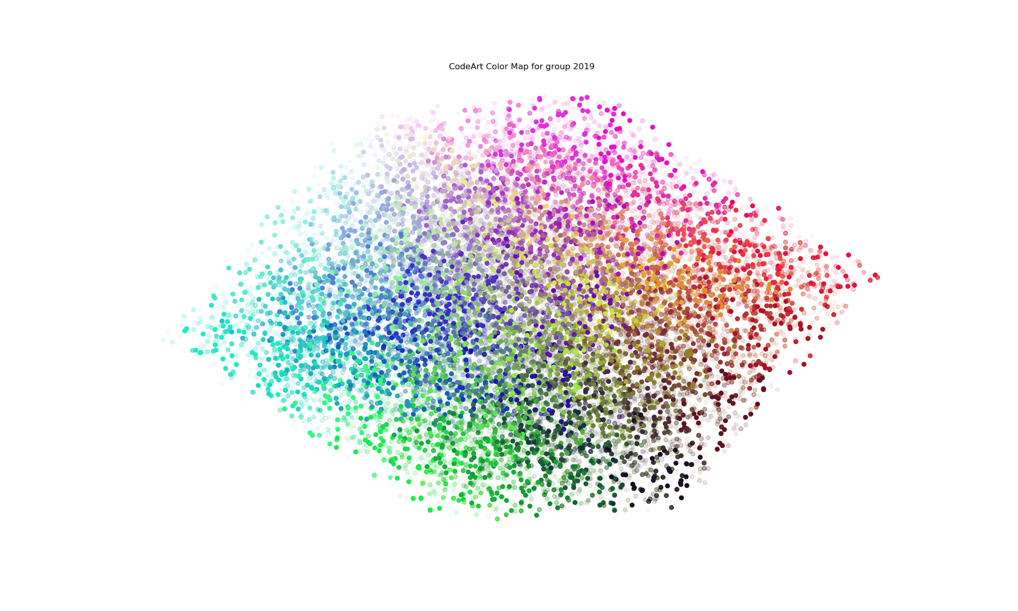
You’re looking at all terms across all years, which is why all colors have opacity of 1 and the image is very dense. What about if we filter down to look at a particular year?
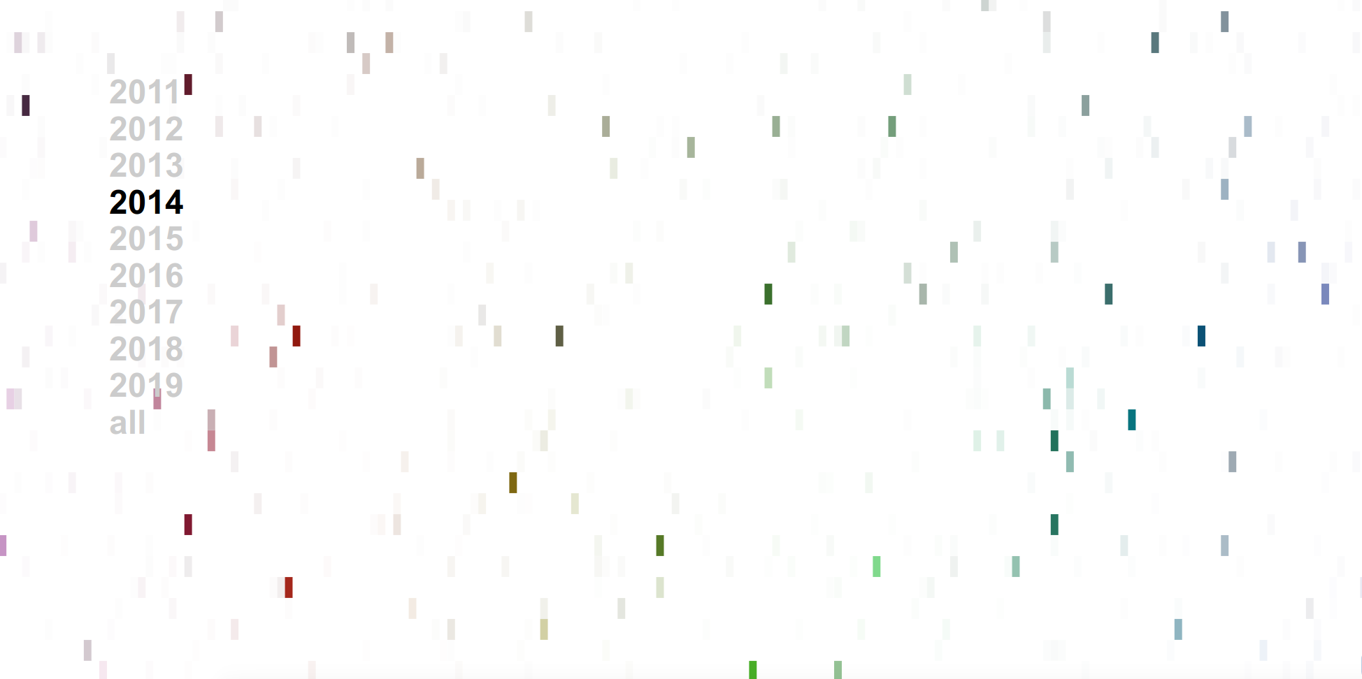
Clicking on a year (a grouping) in this case will then render the same colormap with the opacity of the term colored by the frequency in the codebase. And yes, this coloring is relative to the entire code base, meaning that years with more files will likely have more terms and darker colors than those with not, and this is a choice that I made because I wanted the visualization to reflect that. If I normalized for the year, I wouldn’t be able to look at 2014 and 2017 and quickly know that I wrote a lot more code in 2017. As an example, in 2014 I was working on a lot of neuro-related things, so it’s not surprising to see the term “lobule” show up. If I did this over, I’d want to further segment the years into file types, and confirm that lobule was in some kind of texty file (and not directly in code). I realized fairly quickly that it wouldn’t be quick to develop using such a large dataset (I have a lot of Python code, so I decided to work on other (smaller!) projects.
Example 2: Parsing a Repository
I decided to work on a smaller scale and parse a single repository. I chose to spack because I knew there were a lot of files, and likely some variance in file types (for this time around I was going to do my groupings based on file extensions).
Abstract Art
For the first go, I wanted to give a shot at creating images that replaced the terms in the model with the colors that were represented. I decided to:
- Generate a model for all files across a codebase
- Write a png image for each code file, colored by the word2vec embeddings
- Create an interactive interface to explore by groups (or all files).
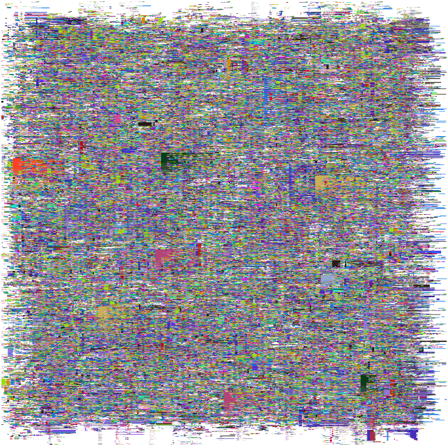
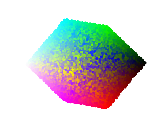
The most abstract of the bunch might look something like this - this is literally a grid of colored code files from spack I also generated an image for each file extension, and you can find those links in the examples here. Here is a quick snapshot of the image generated for all files:
and the interactive version where you can click on the code files is here. It’s very arty and abstract right? I call this a success! The general generation looks like this:
from codeart.main import CodeBase
code = CodeBase()
code.add_repo("https://github.com/spack/spack")

# See languages with >10 files
code.threshold_files(10)

# Generate a web report (one page per language above this threshold)
code.make_gallery(groups=list(code.threshold_files(10).keys()))
I really liked how abstract and weird it came out. I can’t say I’d hang it in my living room, but I’m very pleased with this general idea of using the code files as pixels for some larger work. I’ve generated functions and examples to allow you to do that, and follow your own creativity. As a reminder, to extract color vectors for some group (or all groups) you can just do:
vectors = code.get_vectors("all")
and then to generate the images, you could do:
code.make_art(group="all", outdir='images', vectors=vectors)
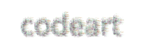
Text Art
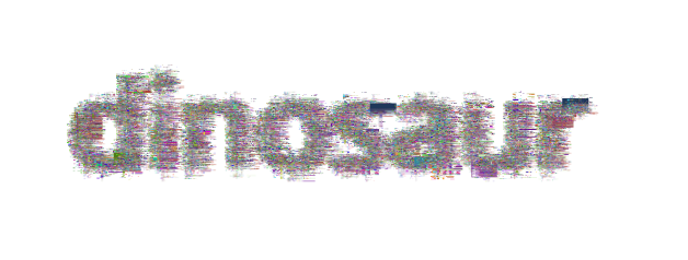
I thought it would also be fun to generate similar images, but instead of not having any structure, taking the shape of text. I was able to do this by writing font onto an image layer, and then using the pixels written as a mask. The functions work like this (and note that we need to have generated the code art images to go along with it):
from codeart.colors import generate_color_lookup
images = glob("images/*")
color_lookup = generate_color_lookup(images)

# Generate an image with text (dinosaur!)
from codeart.graphics import generate_codeart_text
generate_codeart_text('dinosaur', color_lookup, outfile="text.html")
and for spack:
generate_codeart_text('spack', color_lookup, outfile="spack.html", font_size=100, width=1200)
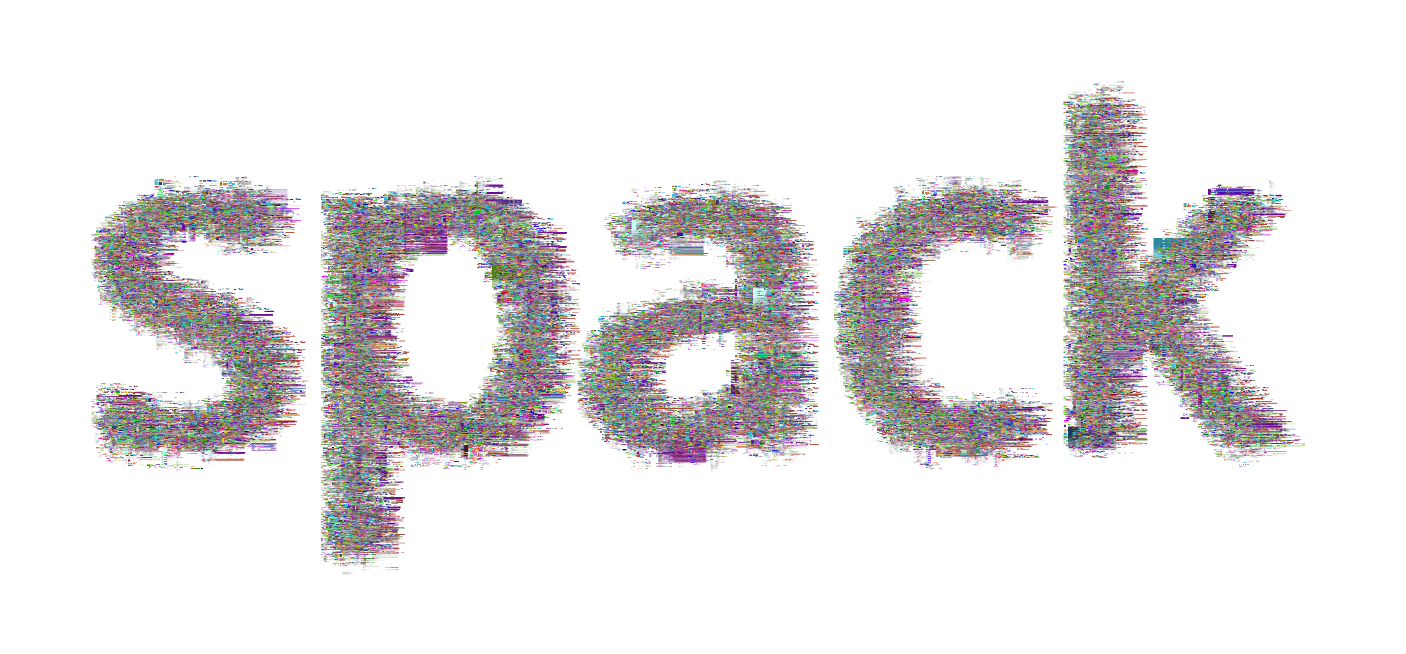
Click on either of the images above to see the interactive versions. You can of course adjust the font size, etc.
Interactive Colormaps
Similar to the yearly colormaps (but easier to render in a browser since there are fewer colors) I wanted to generate interactive colormaps for the spack (or example repository). Part of this process is also extracting counts for the terms across the codebase. That looks like this:
from codeart.graphics import generate_interactive_colormap

vectors = code.get_vectors('all')
counts = code.get_color_percentages(groups=list(code.codefiles.keys()), vectors=vectors)
generate_interactive_colormap(vectors=vectors, counts=counts, outdir="web")
The first version (not well sorted) can be seen here
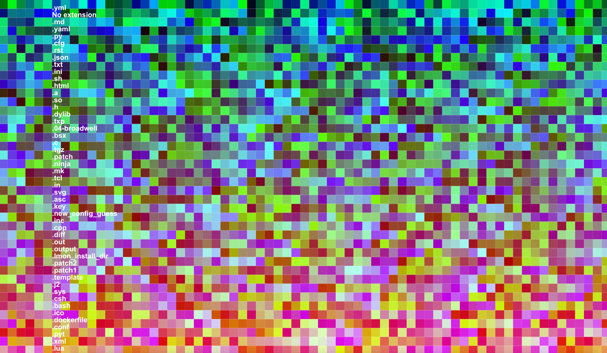
and the sorted version here.
You can again click on the extensions to see the colors change, and not surprisingly, spack has mostly Python code (extension .py). For the second plot (sorted) since the color RGB values are sorted based on similarity, you can also deduce that similar colors indicate similar terms, which indicates similar context in the code files.
Color Lookup Grids
In the case that you produce some meaningful art, it would be really useful to have a color lookup grid. Mind you that this gets unwiedly given way too many colors, but we do the best that we can. Here is what that looks like - I don’t remember what file extension I used here, but it was for a subset of the files in spack. Note that I had exported vectors just for that extension.
save_vectors_gradient_grid(vectors=vectors, outfile='spack-image-gradient.png')
Code Trees
After I created the abstract art, I wanted to plot the same images, but with a little more context. This led to the code tree, a derivation of a container tree but with code images shown instead of container files.
I put this together quickly so the interaction is a little wackadoo, and I didn’t try to make it perfect because I ultimately didn’t think it was a useful visualization.
Example 3: Parse Folders
For kicks and giggles, I generated a much larger model across all my Python code. Here is the color lookup grid (one (for all of my Python code):
This code base also took me through a more complete exercise to generate my original color map, mainly because I had a lot more colors to work with! You can follow the notebook here and I’ll briefly show some of the images produced. Here is the first go to plot the colors in 3d.
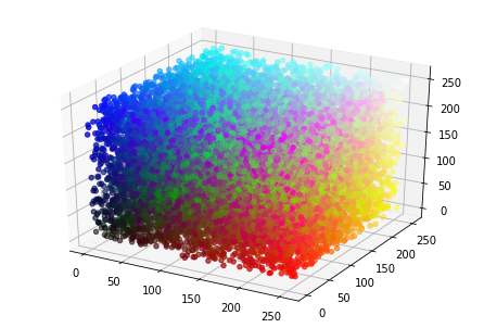
And if we do dimensionality reduction, we can plot this in 2d:
And finally, we can assess counts for any particular extension across the codebase to derive images that use transparency to show the prevalence of any given term. This is akin to the gif I showed earlier.
Example 4: Dockerfiles
Somewhere in the middle of this nonsense I recreated the Dockerfiles dinosaur dataset to interact with the updated Docker Hub API, and it only felt natural to generate a sorted and unsorted colormap for those files. I enjoy browsing the sorted to see what terms appear close to one another. And I think what we are really seeing here is that there are a lot of terms with weak similarity (the majority of ugly greens) and then only a subset of terms that are similar (blues and reds in the corners). I suspect a little better filtering and exploring of this model is in order! See the project folder to poke around for yourself.
Example 5: GitHub Action and Client
Finally, I decided to choose my favorite of all of the above (the text generated with code files!) and generate a GitHub Workflow example that you could use to generate a set of static files (and images) for your GitHub pages. It’s based on the very limited codeart client:
> codeart --help
usage: codeart [-h] [--version] {textart} ...

Code Art Generator

optional arguments:
  -h, --help  show this help message and exit
  --version   print the version and exit.

actions:
  actions for Code Art generator

  {textart}   codeart actions
    textart   extract images from GitHub or local file system.
That currently only has one command - to generate a code art text graphic. Be aware that this generates one image per code file, and should be done for small code bases, or larger ones with caution.
codeart textart --help
usage: codeart textart [-h] [--github GITHUB] [--root ROOT] [--outdir OUTDIR]
                       [--text TEXT]

optional arguments:
  -h, --help       show this help message and exit
  --github GITHUB  GitHub username to download repositories for.
  --root ROOT      root directory to parse for files.
  --outdir OUTDIR  output directory to extract images (defaults to temporary
                   directory)
An example might be the following:
codeart textart --root ${PWD} --text codeart --outdir docs/
to produce this little guy:
Too Long, Didn’t Read
In a nutshell, the idea behind this library is simple, and perhaps the most basic use cases to generate this core data can be useful for your work, whether fun or serious.
- Generate Word2Vec embeddings with 3 dimensions for a corpus, in this case, code files
- Map the embeddings to a color space
- Visualize (and otherwise use) the RGB embeddings for visualizations
Ironically, I don’t find any of the art that I produced very aesthetically pleasing, but I’m hoping that the library might inspire others to create better things. If you make something interesting, or have an idea for a visualization to extend the library, please open an issue!.