This is a crosspost from VanessaSaurus, dinosaurs, programming, and parsnips. See the original post here.
Web assembly can allow us to interact with compiled code directly in the browser, doing away with any need for a server. While I don’t do a large amount of data analysis for my role proper, I realize that many researchers do, and so with this in mind, I wanted to create a starting point for developers to interact with data in the browser. The minimum conditions for success meant:
- being able to load a delimited file into the browser
- having the file render as a table
- having the data be processed by a compiled wasm
- updating a plot based on output from 3.
And of course we would also want to start with dummy data, and provide input fields to customize inputs and outputs.
In a Nutshell
I’ve created regression-wasm, a web assembly (wasm) + GoLang (static!) application that can be used to run and plot a linear regression. It can serve as a starting point for some simple exploratory data analysis, or for a developer, a starting point to develop some custom GoLang-based data science tool that generally interacts with tabular data. We are using this regression library, and supporting both simple and multiple linear regression. To make it fun, I added a cute gopher. Because this site is amazing. Here he is, in all his glory:

I’d really like to see others developing in Web Assembly, and making better static tools than are currently afforded, and this seems like a good way to do that. If a researcher publishes a model, an interface should be provided to play with it. It needs to be static so we don’t need to pay for a server, and can use something like GitHub pages. If we have these basic interfaces, it becomes easier for developers to test more advanced things like streaming data, and interacting with other input sources and resources.
How does it work?
Here is how it works. The data you input drives the graph produced.
- TLDR: Run a multiple or simple linear regression using Web Assembly
- Two variables (one predictor, one regressor) will generate a line plot showing X vs. Y and predictions
- More than two variables performs multiple regression to generate a residual histogram
- Upload your own data file, change the delimiter, the file name to be saved, or the predictor column
Can you show me an example?
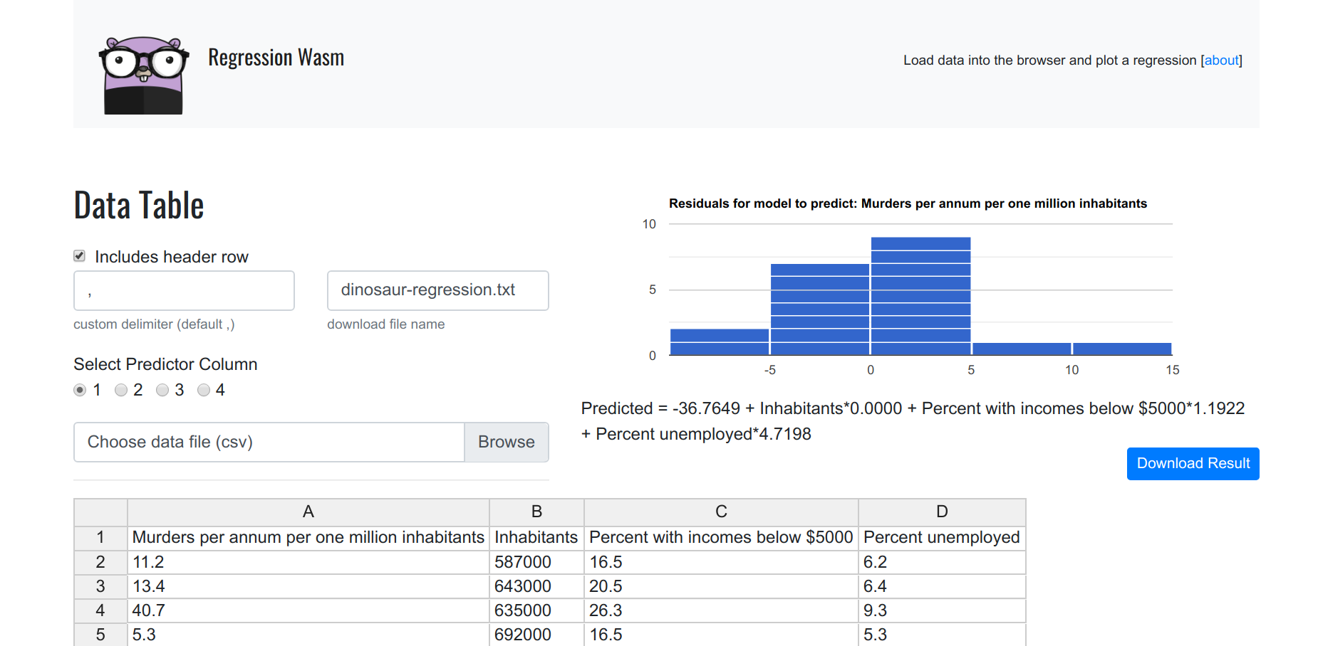
When you load the page, you are presented with a loaded data frame. The data is a bit dark - it’s trying to show how poverty, employment, and population might relate to murder. It’s actually a nice dataset to show how this works. The first column is the number of murders (per million habitants) for some city, and each of the remaining columns are variables that might be used to predict it (inhabitants, percent with incomes below $5000, and percent unemployed).
Formula
The formula for our regression model is shown below the plot, in human friendly terms.
Predicted = -36.7649+ Inhabitants*0.0000 + Percent with incomes below $5000*1.1922 + Unemployed*4.7198
This comes directly from the model library, which is provided by @Sajari.
Residuals
Given that we have more than one regressor variable, we need to run a multiple regression, and so the plot in the upper right is a histogram of the residuals.
the residuals are the difference between the actual values (number of murders per million habitants) and the values predicted by our model.
I’m not sure what the “best” plot to show here would be - we could do a matrix of plots, but I wanted to keep it simple, and chose a histogram of the residuals.
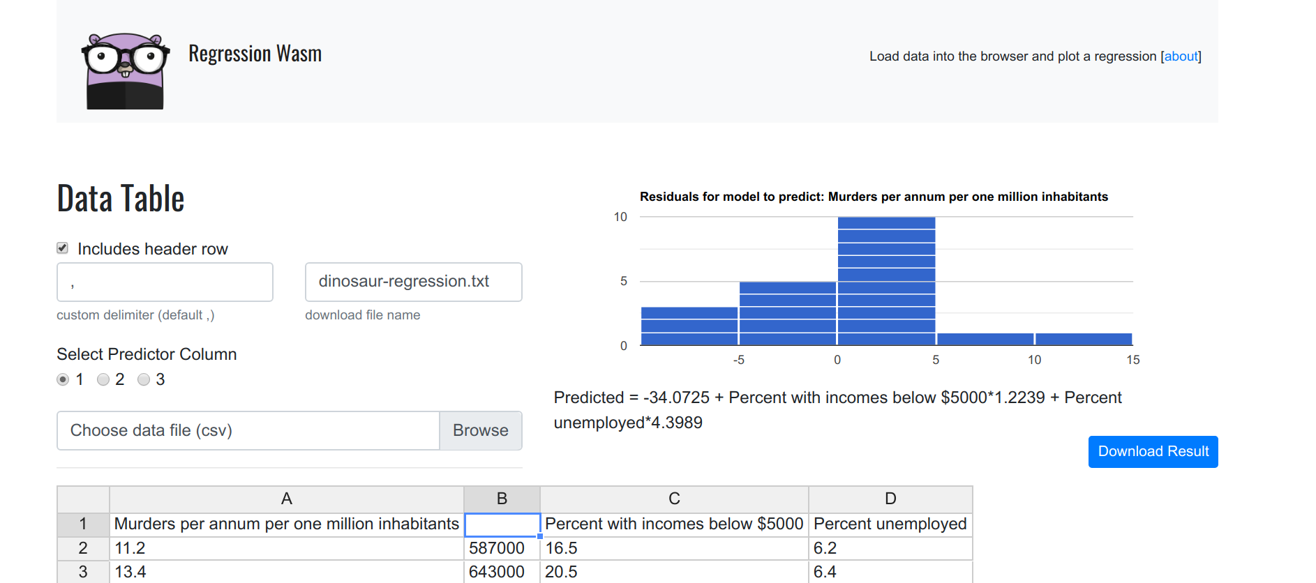
Filtering
If you remove any single value from a row, it invalidates it, and it won’t be included in the plot. If you remove a column heading, it’s akin to removing the entire column.
Plotting
But what if we want to plot the relationship between one of the variables X, and our Y? This is where the tool gets interesting! By removing a column header, we essentially remove the column from the dataset. Let’s first try removing just one, Inhabitants. In the plot below, we still see a residual plot, and this is because there are still three dimensions to plot.
Let’s remove another one, the percent unemployed, leaving only two dimensions.
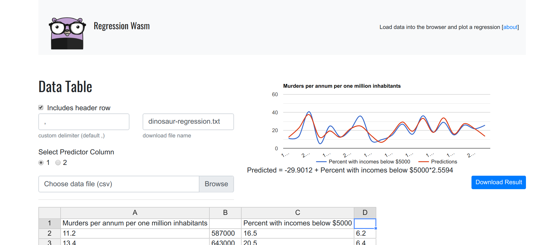
Now we see a line plot, along with the plotting of the predictions! By simply removing each column one at a time (and leaving only one Y, and one X) we are actually running a single regression, and we can do this for each variable. Now it gets kind of fun! This could actually be useful for someone:
Inhabitants to predict murders
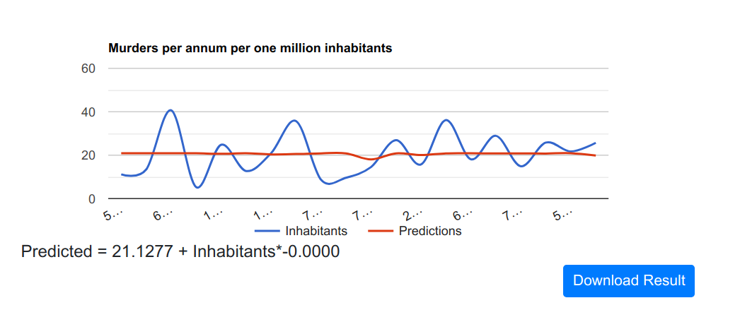
Yeah, so this variable is fairly useless. The number of inhabitants of some city doesn’t really say anything about murders.
Unemployment to predict murders
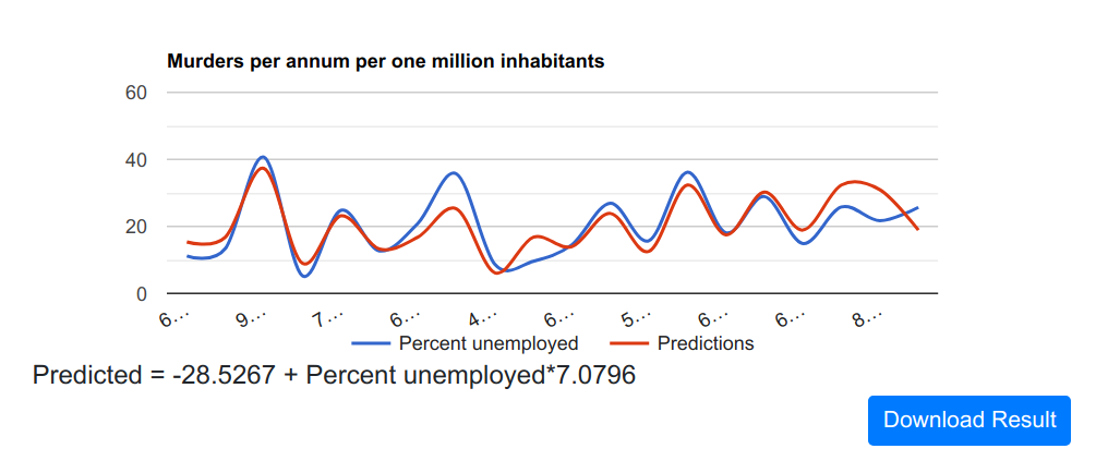
Now this is more interesting! There is definitely a correlation between unemployment and murders.
Low Income Percentage to predict murders
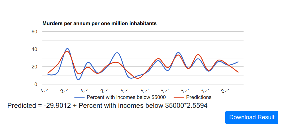
And logically, I would guess if unemployment is correlated with number of murders, income would be too.
Download Data
This of course is a very superficial overview, you would want to download the full model data to get more detail: The “Download Result” button (shown in the images above) will appear after you generate any kind of plot, and it downloads a text file with the model output. Here is an example:
Dinosaur Regression Wasm
Predicted = -36.7649 + Inhabitants*0.0000 + Percent with incomes below $5000*1.1922 + Percent unemployed*4.7198
Murders per one million inhabitants|Inhabitants|Percent with incomes below $5000|Percent unemployed
11.20|	587000.00|	16.50|	6.20
13.40|	643000.00|	20.50|	6.40
40.70|	635000.00|	26.30|	9.30
5.30|	692000.00|	16.50|	5.30
24.80|	1248000.00|	19.20|	7.30
12.70|	643000.00|	16.50|	5.90
20.90|	1964000.00|	20.20|	6.40
35.70|	1531000.00|	21.30|	7.60
8.70|	713000.00|	17.20|	4.90
9.60|	749000.00|	14.30|	6.40
14.50|	7895000.00|	18.10|	6.00
26.90|	762000.00|	23.10|	7.40
15.70|	2793000.00|	19.10|	5.80
36.20|	741000.00|	24.70|	8.60
18.10|	625000.00|	18.60|	6.50
28.90|	854000.00|	24.90|	8.30
14.90|	716000.00|	17.90|	6.70
25.80|	921000.00|	22.40|	8.60
21.70|	595000.00|	20.20|	8.40
25.70|	3353000.00|	16.90|	6.70

N = 20
Variance observed = 92.76010000000001
Variance Predicted = 75.90724706481737
R2 = 0.8183178658153383
Mind you I’m a terrible data scientist. I’ll leave this up to you!
How would I do it over?
As soon as I realized that I wanted data and functions to update dynamically, I regretted not using Vue.js, so if I did this over, I’d use it. A few issues that I’d like to figure out are:
- maintaining a state from some previously built model or loaded data
- starting with a pre-built model to predict something
- optimizing sending data to and from JavaScript to GoLang
If anyone has ideas about the above, please let me know! I’ll probably try working on some of the above for some future fun project. I’m also looking for an excuse to develop an API of web assembly functions, so if you are a researcher and need a thing, please reach out!
Development and Questions!
For notes on development (local and Docker based) please see the repository. If you need any help, or want to request a custom tool, please don’t hesitate to open up an issue.